Unfortunately, Internet Explorer is an outdated browser and we do not currently support it.
To have the best browsing experience, please use Google Chrome, Firefox, Microsoft Edge or Safari.
We use cookies to improve your experience on our website. By continuing to browse this website, you agree to our use of cookies. For more information, please refer to our privacy policy.

This is a self-funded case study using our packaging testing solution. Curious about the 9 essential ingredients for creating packaging that drives shopper growth? Explore our Packaging Effectiveness Playbook.
As communication channels become more fragmented and reaching consumers ever-increasingly difficult, the role of packaging in the marketing mix continues to grow in importance. For some people, packaging is the only experience they ever have with a brand – so ensuring it’s working as hard as possible is imperative for marketers.
We’ve seen a number of iconic brands, including Pringles and Miller Genuine Draft, undergo redesigns over recent years — reflecting the need to adapt to both the changing competitor landscape and evolving consumer needs. These examples also highlight that change carries risks — requiring a delicate balance between purposeful evolution and retaining the incumbent’s strengths.
Enter Häagen-Dazs – for decades synonymous with decadent and sensual flavor experiences, the brand recently underwent a packaging refresh. Underpinning the redesign was an attempt to evoke a sense of ‘affordable luxury’, with a renewed focus on ‘comfort’ over ‘extravagance’.
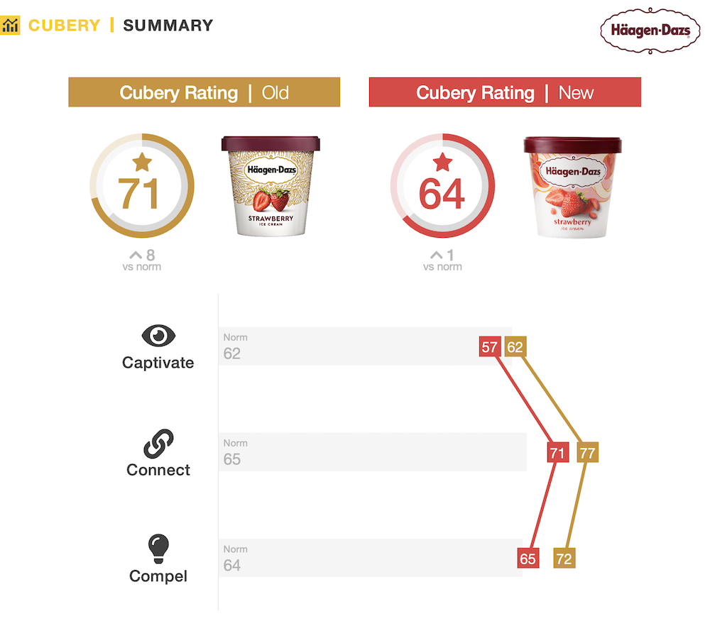
How did the revamp fare in the U.S.? We tested it using our 3C’s framework to find out.

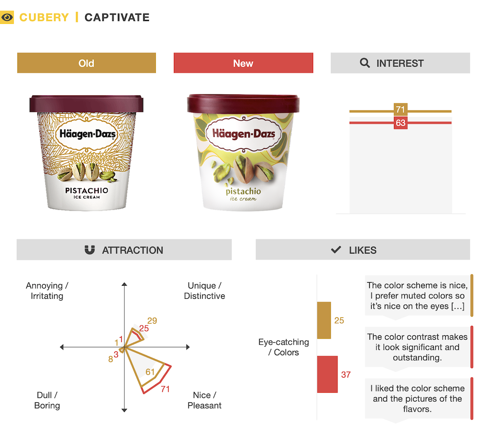
The redesign aimed to bring more personality and approachability to the pack, and in this respect, it succeeded – people found the refresh a little more exciting than the original. However, despite people enjoying the brighter and more colorful flavor cues, the new design aligned more closely with category conventions – subsequently resulting in diminished interest relative to its predecessor.
In addition, despite added emphasis on ingredients and flavor cues for the new design, people were still favorable toward the old pack’s simpler and more understated aesthetic.

Unsurprisingly, the original pack was unmistakably for Häagen-Dazs – a highly recognizable design featuring many well-entrenched structural elements. While consistencies in the overall shape, information hierarchy, and imagery for the new pack ensured there remained strong fluency, by forgoing the uniform background tapestry a notable design feature was lost.

With the gold tapestry evolved, the bright swirling texture which replaced it was successful at conveying a sense of modernity. However, by shifting to a softer, more colorful visual aesthetic and typeface, the new pack lost some of what made the proposition different versus competitors — the sophisticated stylings of the original pack evoked connotations of quality and taste, and these weren’t as pronounced for the new design.

While design enhancements gave the brand the approachability it sought, this also came at a cost – demonstrating the tightrope that must be traversed when it comes to a packaging revamp. The replacement of a distinctive branding property (the gold background tapestry) not only diminished ease of identification, but also detracted from what makes the brand ‘special’. Despite a renewed emphasis on affordable luxury for the new design, perceptions of taste, quality, and value all softened versus the original.
Putting strategy aside, this case study provides a reminder of the role packaging plays in reinforcing a brand’s positioning as an economy, mainstream, or premium brand. If uber-premium credentials are the goal, both design and structural elements must appropriately align with this. Here, dialing-back the minimalistic aesthetic, metallic hues, and strong, confident typography resulted in the brand’s perceived superiority taking a backward step.

Want to test your own advertising, packaging, or product ideas? Cubery combines a team of creative effectiveness experts with cutting-edge technology, bridging the gap between creativity and commercial impact. Get in touch to learn how we can unlock growth for your brand.
