
Unfortunately, Internet Explorer is an outdated browser and we do not currently support it.
To have the best browsing experience, please use Google Chrome, Firefox, Microsoft Edge or Safari.
We use cookies to improve your experience on our website. By continuing to browse this website, you agree to our use of cookies. For more information, please refer to our privacy policy.


This is a self-funded case study using our packaging testing solution. Curious about the 9 essential ingredients for creating packaging that drives shopper growth? Explore our Packaging Effectiveness Playbook.
As time passes, even the strongest of brands can lose a little of their shine. With consumer attitudes and preferences constantly shifting, brand relevancy can slowly erode – with sales inevitably following suit. For brands in this predicament, a refresh can often be appealing; a chance to reinvigorate the brand, build excitement, and prompt reappraisal. However, the decision to upend entrenched branding properties – which may have served the brand well for many decades – often isn’t (for good reason!) taken lightly.
A refresh is a delicate balancing act, with marketers needing to ensure that any rejuvenation or modernization of the brand’s aesthetic doesn’t adversely impact its distinctive assets – and subsequently make it less recognizable. Pringles and The Laughing Cow are examples of successfully managed rejuvenations we’ve recently tested.
Miller Genuine Draft (MGD), however, decided to throw caution to the wind, completely overhauling its iconic packaging in an attempt to transform how the brand is currently perceived.
MGD is a brand with a long history, with its familiar packaging triggering authenticity, expertise, and quality. However, faced with a rapidly evolving competitive landscape, the brand felt a revamp was needed to keep pace and maintain relevance. To quote BrandOpus, the agency behind the reimagining: “Change was needed. It had to be significant enough to disrupt beer consumers at the shelf and drive reappraisal, as well as give the brand meaning over and above product attributes of quality and taste”.
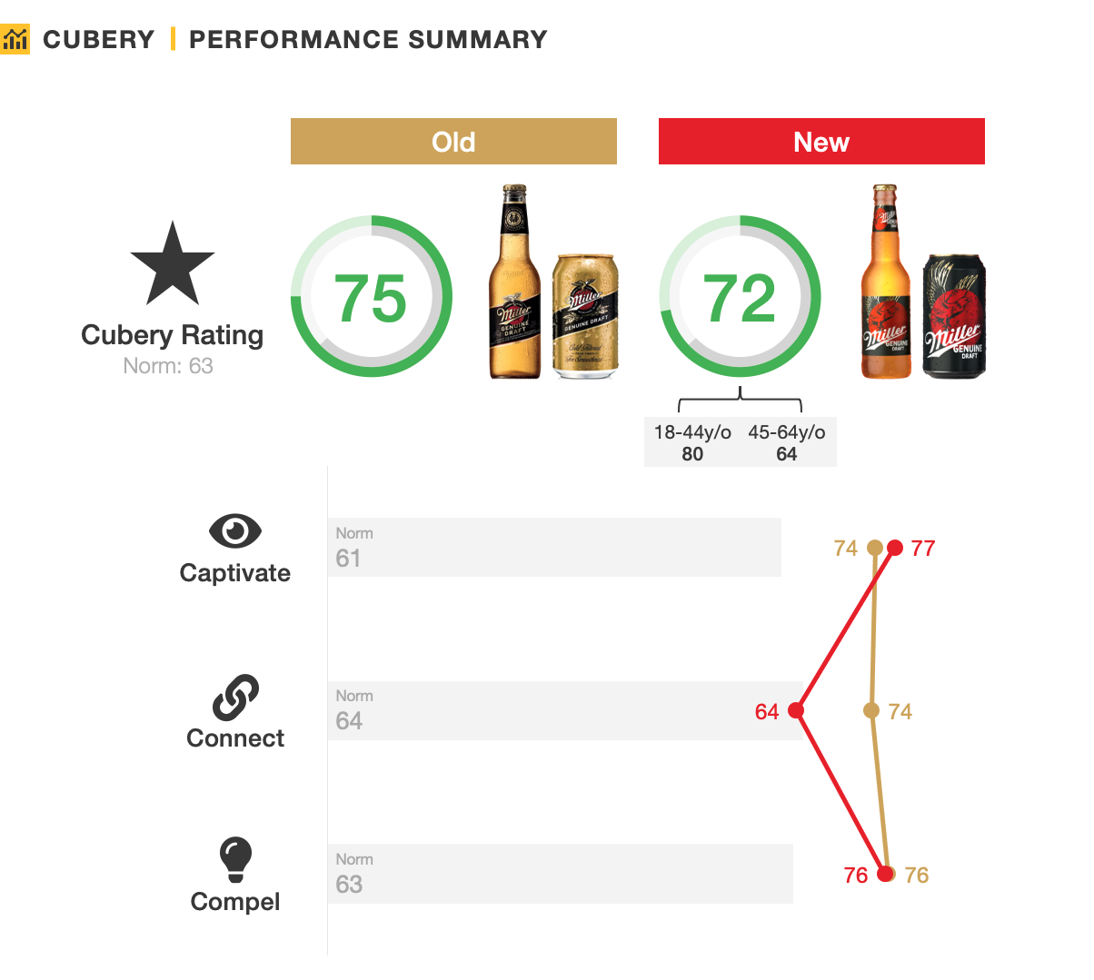
We tested both the old and new designs using our three C’s framework, to find out how the reinvention landed with consumers.
.jpeg)
Given the magnitude of the changes, MGD clearly intended the redesign to stand out and shock people into reappraising the beer. In this respect it succeeded, with the new pack considered more unique and eye-catching than the incumbent, elevating the role of the black background and red ‘sun’. While this relegated MGD’s previously dominant gold to a distant secondary role, the change resulted in greater on-shelf presence.
People also took notice of the radical change to the MGD eagle, now a standout design element. The shift in design priorities did, however, elicit some push-back from the brand’s core consumer group (45+ y/o’s), with some a little put off by the more contemporary direction.

The obvious benefit of such an established aesthetic is that it becomes instantly recognizable, enabling quick and easy decision-making. In this case the gold-and-black palette helped almost half of category consumers link the original packaging to MGD. This fell to just a quarter for the new black-and-red (and recessive gold) colorings. This shift, however, was counterbalanced somewhat by the logo being a much more dominant feature of the new packaging, suggesting the wordmark, red circle, and eagle all have significant equity.
Naturally, significant design alterations will always ruffle a few feathers, particularly amongst those with a deeper affinity for the brand. While keeping intact many of the brand’s distinctive assets meant the new design still aligned reasonably well with how people think of MGD, older consumers (45+) considered it a worse ‘fit’ than the legacy equivalent. Conversely, younger consumers (18-44) were much more open to brand cues being adapted, feeling as though the new design better embodied how they think of MGD.

A crucial objective of the refresh was to “breathe meaning” back into the MGD brand, giving it new depth and identity. However, dialing-up one aspect often comes to the detriment of another, with the new design sacrificing perceptions of authenticity and premium-ness – particularly amongst older consumers.
But, with the goal of breaking the status quo, the changes did also lead to stronger perceptions of modernity. In addition, they crucially made the product a more emotionally compelling and differentiated proposition amongst the younger (18-44) target audience – delivering on the objective of bringing new consumers into the brand.

When summarizing the MGD redesign, the old analogy of ‘you can’t make an omelet without breaking a few eggs’ comes to mind. By moving away from more traditional fonts, imagery, and colorings, a conscious decision was made to depart from cues and associations which have served the brand well for many decades. However, as trends, needs, and the competitive landscape all change, brands must also be brave and adaptable in order to stay relevant.
Miller Genuine Draft decided to take a step back before moving forward, and has been rewarded with a positive reception from the younger target audience, and a manageable backlash from the older cohort.
The more contemporary and modern look and feel enhanced predisposition toward MGD, while the careful repurposing of distinctive assets meant much of the brand’s equity and recognizability was kept intact – giving MGD a great platform to soar again in the future.
This is a self-funded case study using our Packaging Testing solution. Get in touch to receive the full report.
We were supported by market research technology platform Cint to collect data from respondents in the US.
Want to test your own advertising, packaging, or product ideas? Cubery combines a team of creative effectiveness experts with cutting-edge technology, bridging the gap between creativity and commercial impact. Get in touch to learn how we can unlock growth for your brand.

.png)