
Unfortunately, Internet Explorer is an outdated browser and we do not currently support it.
To have the best browsing experience, please use Google Chrome, Firefox, Microsoft Edge or Safari.
We use cookies to improve your experience on our website. By continuing to browse this website, you agree to our use of cookies. For more information, please refer to our privacy policy.


This is a self-funded case study using our packaging testing solution. Curious about the 9 essential ingredients for creating packaging that drives shopper growth? Explore our Packaging Effectiveness Playbook.
While consumers are by-and-large indifferent to marketing and advertising, there’s one thing that gets them fired up like nothing else – a brand refresh. Even the smallest of changes to a pack or logo can trigger a great deal of excitement, confusion, and sometimes hostility – sort of like a close friend getting glasses or a new haircut.
There has been a growing trend over recent years toward minimalism in brand design, being perceived as increasingly important for the mobile age. While flatter, monochrome, and minimalistic design has become commonplace in services and higher ticket categories (nowhere more so than automotive), this trend has started making its way into the consumer goods category.
This presents a conundrum for marketers. On one hand they want to ensure their brands are perceived as modern and contemporary, while on the other there’s pressure to keep intact established properties which have served them well for many years – often decades.
‘Mr. Pringle’ is one of the world’s most well-known brand ambassadors. While a trimming or two of his iconic moustache has gone largely unnoticed over the years, his “flattening” in 2021 raised eyebrows. It made us wonder – how would minimalism be received for a brand whose strength is largely derived from its warm and playful personality? To find out how Pringles’ new packaging stacked-up against its predecessor, we used our three C’s framework.
.png)
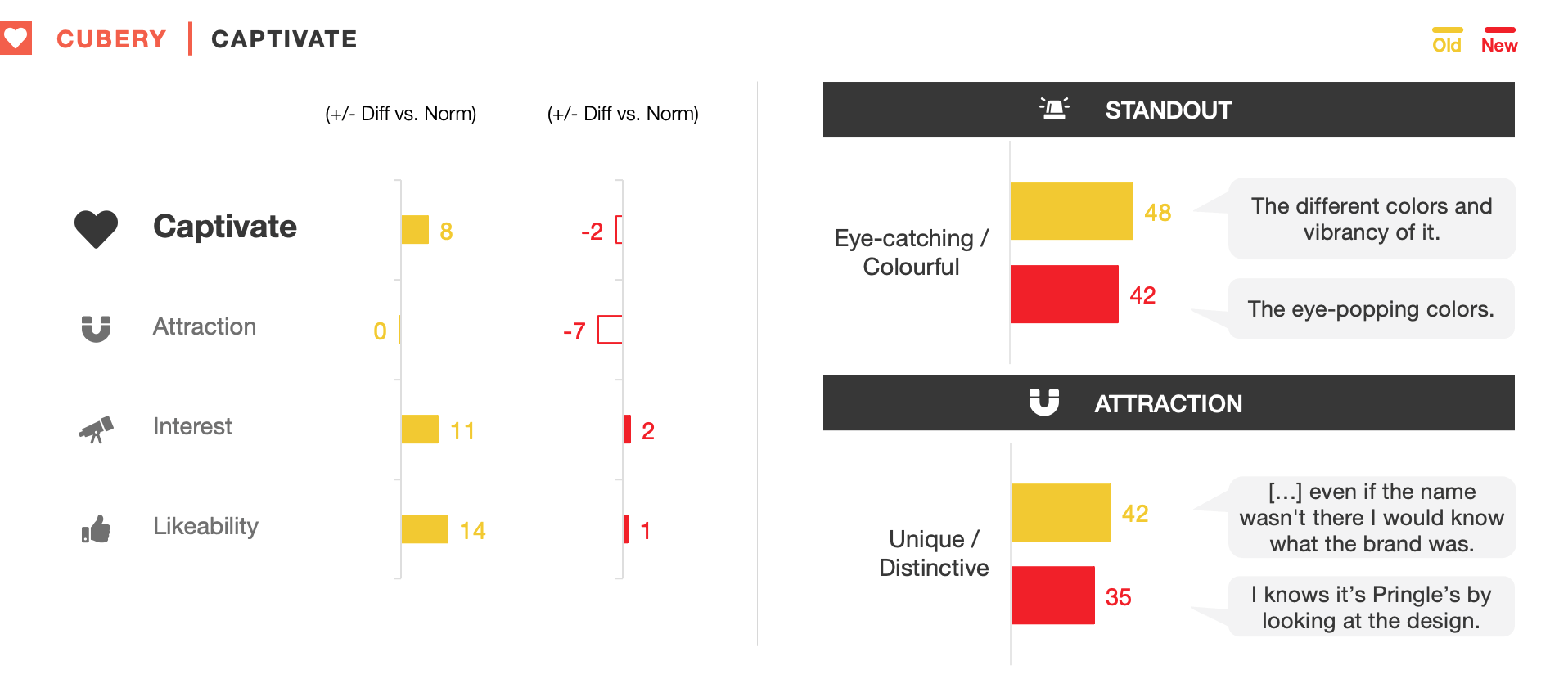
Pringles’ packaging demands shoppers’ attention on-shelf – not only because of its unique cannister shape, but also the bright colors representing each flavor. With the re-design following the same layout and color scheme as the original, it was therefore unsurprising that people considered it almost equally eye-catching.
However, the new design was also found less interesting and unique, limiting how well it sustained people’s curiosity. This was largely a function of the “standardized” flavor imagery and sleeker fonts – rather than alterations to Mr. Pringle’s appearance.
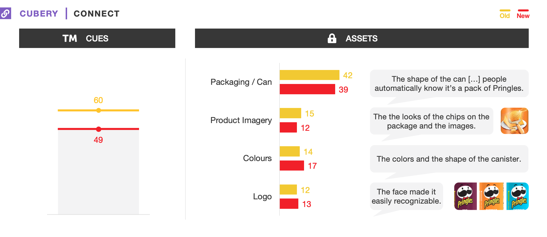
Pringles is the dominant leader in the cannister chip category, which gives the brand a unique advantage in that much of its recognizability comes from the shape of the can itself. Combined with the hierarchy of information typically presented on-pack, this has afforded the brand the luxury of tweaking individual branding properties without detracting significantly from ease of identification.
However, the more elaborate depiction of flavor imagery on the old pack – which more creatively emphasized the ingredients – served as a stronger brand cue than for the new design.
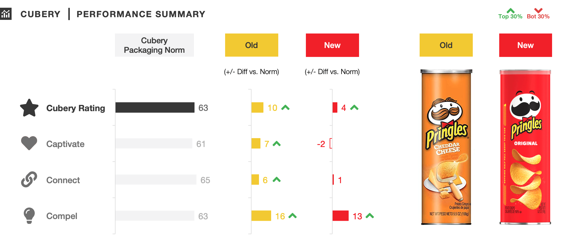
The marketing team’s goals for the re-design were to create a “modern” look that would reflect the “bold” flavor of Pringles. On the first objective they certainly succeeded – the “flattened” and simplified visuals pushed Pringles into a cooler, more modern, and trendy space. People also considered the brand to be a little more innovative and gourmet – thanks in part to the contemporary flavor cues and refreshed imagery.
However, the old design made Pringles seem tastier and more flavorsome. While the revamped imagery drove up-market connotations, at the same time this detracted from how creative and imaginative the flavor range was perceived to be – subsequently making Pringles seem less different versus competitors.

An existing pack design has an inherent advantage when it comes to research, with people typically more receptive toward the familiar. While Pringles’ refreshed design didn’t quite reach the same heights as the original, it still retained many of its strengths while also contemporizing the brand.
A lot of discussion within the marketing community centered around whether Mr. Pringle himself had been tarnished by the revamp; however, the key reasons for why the new pack fell behind by-and-large didn’t relate to the logo overhaul. Instead, the formalized arrangement of smaller elements detracted slightly from the new design’s ability to stand out on-shelf and synergize with the brand’s typically fun and light-hearted positioning.
While keeping a brand’s distinctive assets intact should be a brand team’s number one priority when undertaking a refresh, it also shouldn’t be forgotten that smaller elements can play an important role in building the brand’s personality – and in-turn driving predisposition.
We were supported by market research technology platform Cint to collect data from respondents in the US.
Want to test your own advertising, packaging, or product ideas? Cubery combines a team of creative effectiveness experts with cutting-edge technology, bridging the gap between creativity and commercial impact. Get in touch to learn how we can unlock growth for your brand.

.png)