
Unfortunately, Internet Explorer is an outdated browser and we do not currently support it.
To have the best browsing experience, please use Google Chrome, Firefox, Microsoft Edge or Safari.
We use cookies to improve your experience on our website. By continuing to browse this website, you agree to our use of cookies. For more information, please refer to our privacy policy.


This is a self-funded case study using our packaging testing solution. Curious about the 9 essential ingredients for creating packaging that drives shopper growth? Explore our Packaging Effectiveness Playbook.
Classic and contemporary — can the two exist in harmony? When it comes to packaging design, this is a dilemma faced by many brands as they look to elevate their visual identity without disrupting existing memory structures.
Following the likes of Häagen-Dazs and Drumstick, Baskin Robbins is the latest in a long line of ice-cream manufacturers to undertake a design overhaul with a single-minded objective: modernity.
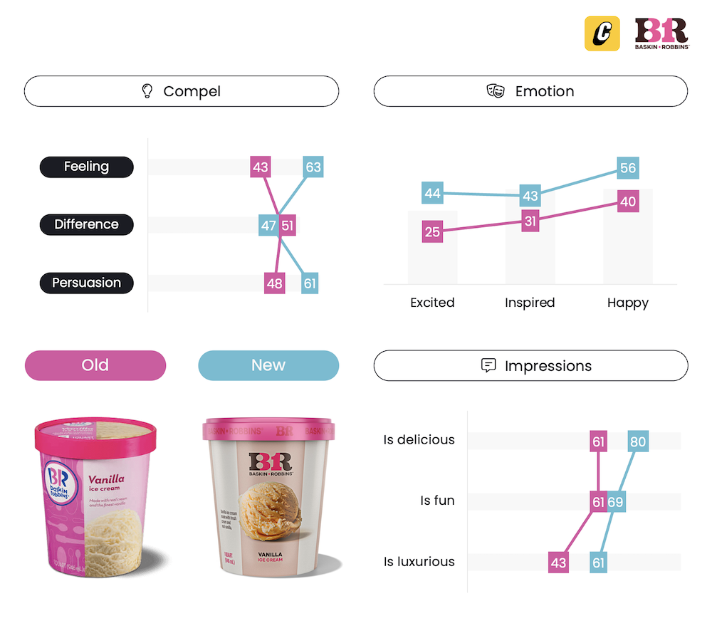
Baskin Robbins’ design agency, ChangeUp, certainly lived up to its moniker, taking a (figurative) sledgehammer to many of the brand’s most established visual elements — colors, flavor imagery, message hierarchy, and logo. How successful was the design overhaul? We tested both the old and new packaging using our 3Cs framework to find out.

The new packaging was a considerable improvement over the incumbent. Generous scoops of topping-laden ice-cream took center stage, working alongside a less striking color palette to enable product imagery to shine. While not overly distinctive, the new packaging successfully eradicated much of its predecessor’s boredom. Reduced emphasis on the confronting bright pink color scheme ultimately helped create a richer emotional response.

While modernization runs the risk of detracting from alignment with existing perceptions, Baskin Robbins successfully navigated this hurdle. The contemporary aesthetic remained in-line with preconceptions of the brand, with the more visually-arresting flavor imagery and premium connotations reinforcing the brand’s reputation for offering great tasting ice-cream. Despite altering many established properties, re-deployment of the (now toned-down) color scheme, bright pink lid, and modernized logo helped maintain easy identification.

The new packaging bolstered product perceptions, with the warmer tones and more appetizing imagery enhancing premium and taste credentials. The “circus-inspired” typography and “classic-meets-modern” color palette ultimately translated into greater excitement and happiness, helping make the brand seem more fun than its predecessor.
Pack design overhauls can be risky undertakings, with our review of Haagen-Dazs’ refresh highlighting how even the smallest of tweaks can diminish a design’s effectiveness. However, change is a constant, and brands must show courage by breaking the mold as competitors increasingly seek to emulate their success.
For Baskin Robbins, while being highly recognizable, its packaging was ultimately holding it back — underdelivering on how strongly it predisposed shoppers toward purchase and limiting its ability to command a price premium. In a category where expectations of premium and artisanal brands has evolved rapidly over recent years, Baskin Robbins’ hasn’t kept up — losing relevance which has ultimately impacted its bottom line.
The redesign successfully addressed these challenges — using color, typography, and product imagery to strengthen associations around taste and quality, along with building fun and contemporary connotations. Importantly, it did this while still paying homage to the brand’s roots.

Want to test your own advertising, packaging, or product ideas? Cubery combines a team of creative effectiveness experts with cutting-edge technology, bridging the gap between creativity and commercial impact. Get in touch to learn how we can unlock growth for your brand.

.png)