Unfortunately, Internet Explorer is an outdated browser and we do not currently support it.
To have the best browsing experience, please use Google Chrome, Firefox, Microsoft Edge or Safari.
We use cookies to improve your experience on our website. By continuing to browse this website, you agree to our use of cookies. For more information, please refer to our privacy policy.

This is a self-funded case study using our packaging testing solution. Curious about the 9 essential ingredients for creating packaging that drives shopper growth? Explore our Packaging Effectiveness Playbook.
Drumstick is a part of Australia’s cultural fabric and an iconic summer tradition. However, diverging consumer tastes and the ‘premiumisation’ of the ice cream category has resulted in Drumstick facing stiffer competition in recent years.
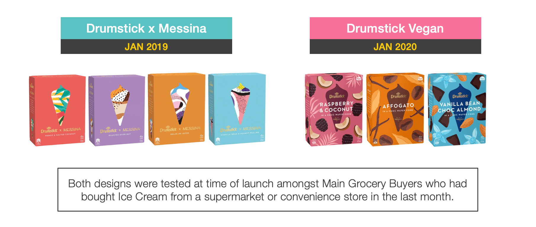
In response, Drumstick partnered with up-market ice cream retailer Messina in 2019 to launch a new product range, and recently followed this up with a Vegan Certified line. These premium, dynamic and visually revamped expressions of the Drumstick brand, have been targeted at segments out of the reach of the brand’s core product range.
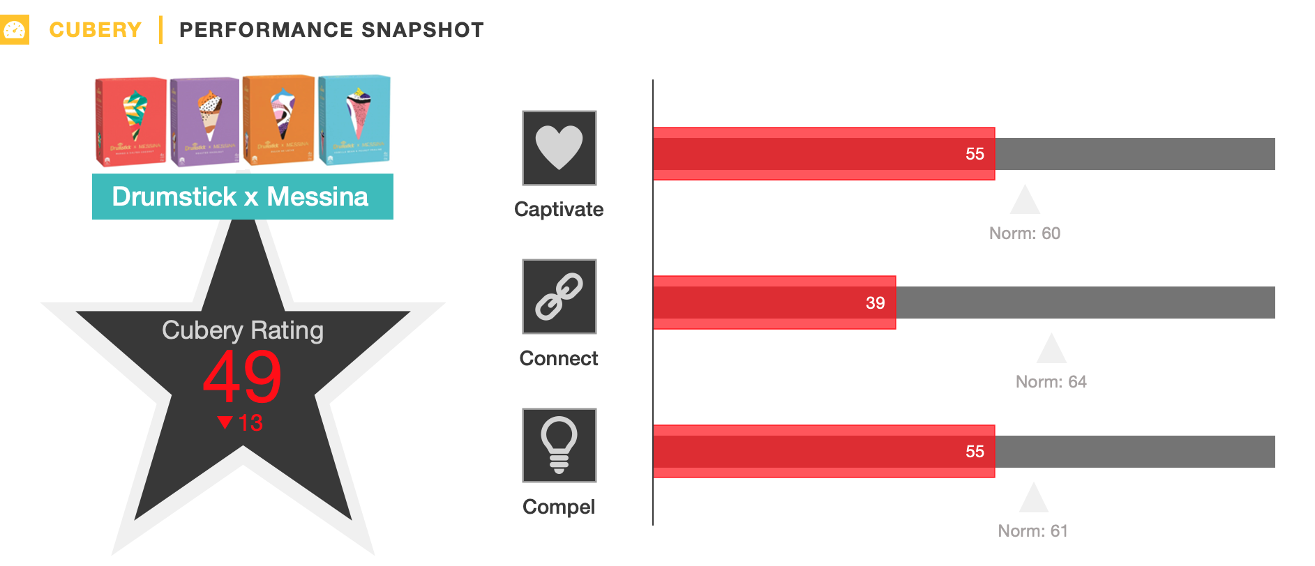
Given one of the most important elements of a successful product launch is its activation at the point of purchase, we decided to see how the new packaging design for Drumstick Vegan stacked up against Drumstick x Messina – the latter of which achieved sub-optimal results when we tested it last year.
The results were fascinating to say the least and provide important learnings for any brand looking to launch a new product range or refresh their packaging design. The effectiveness of packaging designs is a function of 3 ‘C’s’:

Both sets of packaging immediately caught people’s eye with their artistic, pastel-coloured designs, offering good presence on freezer shelves. While the modern and minimalistic design of Messina’s packaging was distinctive, the lack of flavour details and familiar product cues also made it somewhat bland. Conveying only vague information around the flavours and ingredients left people feeling frustrated and confused.

The Vegan packaging was much livelier and more easily interpretable in comparison, integrating flavour cues with vibrant aesthetics to give it a more dynamic and informative feel.

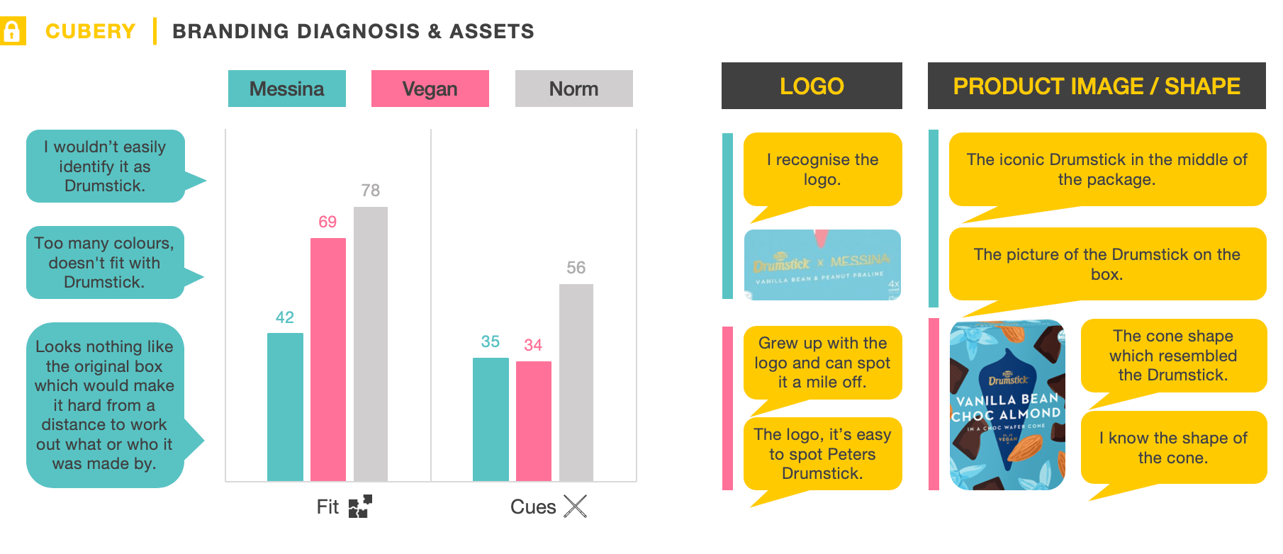
One of Drumstick’s most powerful branding devices is its iconic wafer cone silhouette – an ongoing asset that has taken various forms over the years.
While the abstract cone used in these new designs was striking, only a quarter of people recognised Drumstick from it – the rest of the aesthetic lacked the necessary contextual clues to properly support it.
This was a function of the Messina and Vegan product extensions being a significant departure from Drumstick’s heartland, with the packaging subsequently lacking ‘fit’ with the masterbrand. It will take time before Drumstick’s entrenched associations around ‘traditional’, ‘family’ and ‘value’ pivot toward ‘gourmet’, ‘premium’ and ‘modern’. In a positive early sign, a handful of people picked up on visual cues for the newly-launched Vegan range having synergies with Messina.

While the abstract and artistic visual elements were the most salient aspect of the Messina packaging design, the ingredients and flavours were much more top-of-mind for Vegan. The clearer ingredient illustrations and prominent flavour callouts made the Vegan proposition more easily interpretable, amplifying perceptions of ‘taste’ and ‘quality’ in the process.
The Vegan product was also seen to be newer and more relevant to people’s needs due to its ‘health’ and ‘vegan-friendly’ associations – things which aren’t typically associated with the ice cream category. Importantly, this didn’t detract from the product’s overall appeal, with more people considering Vegan ‘great tasting’ than Messina.
While both packaging designs conveyed ‘luxury’ and ‘premium’ associations, almost half of consumers considered the $9.99 price tag for Vegan ‘good value for money’ compared to only one-in-four for Messina.

This case study provides a timely reminder that the role of packaging isn’t just to captivate shoppers and stand out on supermarket shelves, but to also seed a clear and compelling impression about the brand and product in people’s minds – which ultimately motivates them to purchase.
Making people work hard to understand your brand or message is the cardinal sin of any form of marketing communication, and it is no different for packaging.
Messina x Drumstick fell down because it was too abstract and vague to warrant serious consideration, lacking fluency with the quick and instinctive way shoppers make decisions. In contrast the Vegan proposition was conveyed in a simple and engaging way, making key information highly accessible while not sacrificing visual flair.


Want to test your own advertising, packaging, or product ideas? Cubery combines a team of creative effectiveness experts with cutting-edge technology, bridging the gap between creativity and commercial impact. Get in touch to learn how we can unlock growth for your brand.
