
Unfortunately, Internet Explorer is an outdated browser and we do not currently support it.
To have the best browsing experience, please use Google Chrome, Firefox, Microsoft Edge or Safari.
We use cookies to improve your experience on our website. By continuing to browse this website, you agree to our use of cookies. For more information, please refer to our privacy policy.


This is a self-funded case study using our packaging testing solution. Curious about the 9 essential ingredients for creating packaging that drives shopper growth? Explore our Packaging Effectiveness Playbook.
In a men’s grooming aisle where hyper-masculinity has long been the norm, the softer and warmer tones of Dove Men + Care has always set the brand apart. In a sea of aggressive visual stylings and testosterone fueled propositions the likes of ‘Dragon Blast’ and ‘Dark Temptation’ (yes, those are real deodorant brands!), Dove’s more gentle and calming presence has seen it stand out from competitors.
Through its calming neutral tones and tranquil water ripple imagery, the brand’s packaging conveys a gentle, comforting tone that draws people into its hydrating proposition. So, when the brand launched a subtle new redesign, we wanted to make sure it was still living up to the lofty benchmark set by its predecessor.
At first glance, the changes appeared minimal, with the new pack retaining the incumbent’s gray color foundation and calming blue animation, with similar priority being given to key callouts across each. But part of a pack’s on-shelf impact lies in its ability to unite all of its various design elements into one seamless visual proposition that is noticed, scanned, and interpreted in the blink of an eye.
Here, the old pack worked a little more effectively to achieve this outcome by combining the brand’s softer colors into a more complete visual image of the hydrating droplet effect. With the “moisturizing” callout also more prominently standing out on a white background pill, these elements worked together to have a multiplier effect—reinforcing the key benefit of Dove Men + Care being a moisturizing deodorant.
In contrast, the new pack’s deeper blues and more focused ripple animation struggled to achieve this same outcome. But in saying that, the more contemporary design was not without its strengths. The bolder colors, wavy pattern, and blocky typography all better aligned with expectations of men’s personal care products, helping reinforce perceptions of the brand being long lasting, smelling good, and providing a more effective proposition overall.
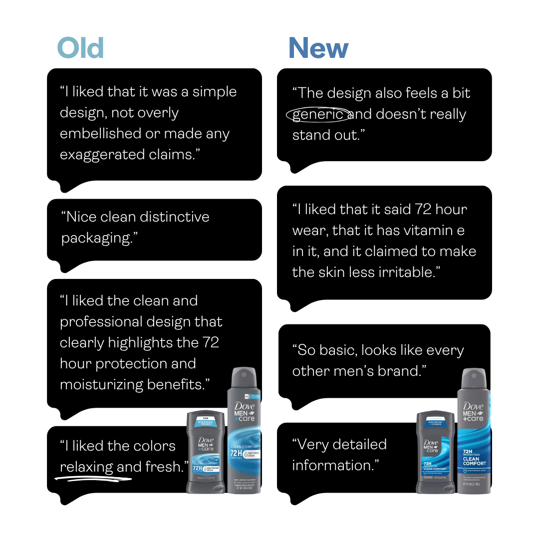
But ultimately, in inching closer to the conventions it once defied, the redesign demonstrated why crafting a perception of being different (for the right reasons) is crucial. Though the new pack undoubtedly drew more attention to core product benefits, in the process it took focus away from the emotional depth that made the incumbent so unique. And along with less visual priority being given to the lockup on the new stick format, the overall design consequently became less “Dove” (and in-turn, was less immediately recognizable).
In railing against intensely masculine category conventions, the old pack crafted a clear space for itself—leading to the design feeling more instinctively for the brand. The benefit? Easier recognition and processing at shelf. Ultimately, packaging needs to deliver the best of both worlds to maximize commercial outcomes: to stand out in an ownable way while communicating features and benefits that deliver on consumers’ most important needs and wants. Combined with maintaining a contemporary feel, navigating this delicate balance boosts the odds that consumers will put you in their shopping baskets.

Want to test your own advertising, packaging, or product ideas? Cubery combines a team of creative effectiveness experts with cutting-edge technology, bridging the gap between creativity and commercial impact. Get in touch to learn how we can unlock growth for your brand.

.png)