
Unfortunately, Internet Explorer is an outdated browser and we do not currently support it.
To have the best browsing experience, please use Google Chrome, Firefox, Microsoft Edge or Safari.
We use cookies to improve your experience on our website. By continuing to browse this website, you agree to our use of cookies. For more information, please refer to our privacy policy.


This is a self-funded case study using our packaging testing solution. Curious about the 9 essential ingredients for creating packaging that drives shopper growth? Explore our Packaging Effectiveness Playbook.
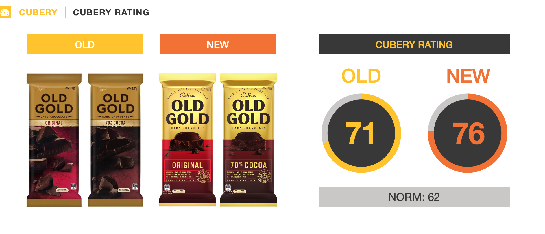
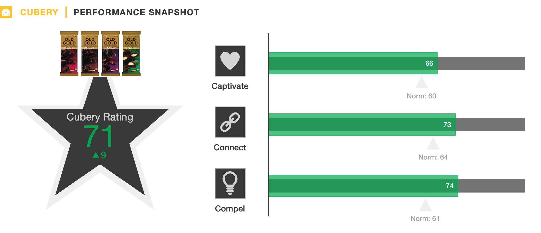
Unconscious bias toward the status quo has important implications for pack testing research – greater familiarity with an existing design will generally lead to higher scores.
Thus, in order to build the necessary confidence to progress with a packaging change, a re-design must come very close to – or ideally match – the performance of its legacy equivalent.
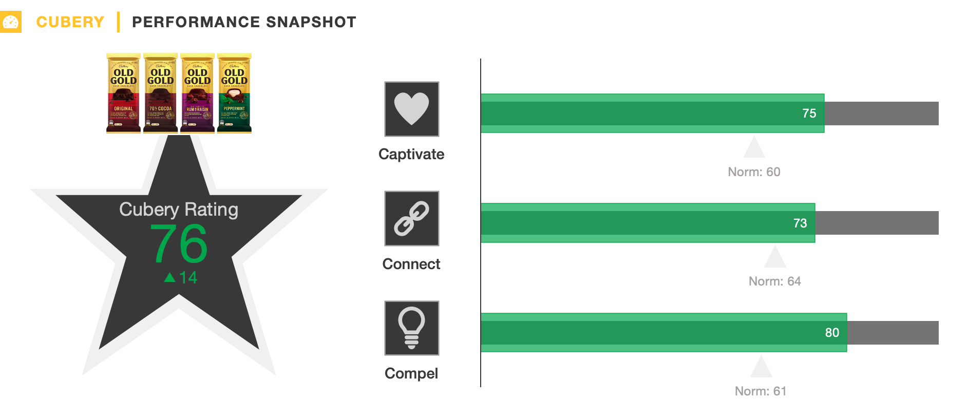
To surpass this benchmark – particularly when the current design is already a strong performer – is a rare feat, but this is exactly what Cadbury Old Gold’s newly-revamped design was able to achieve.
While the aesthetics were modernised and the flavour varieties were presented in a more appealing way, overall the new packaging remained faithful to Old Gold’s long-established heritage.
To break-down exactly what made Old Gold’s packaging re-design a winner, our framework looks at 3 C’s:
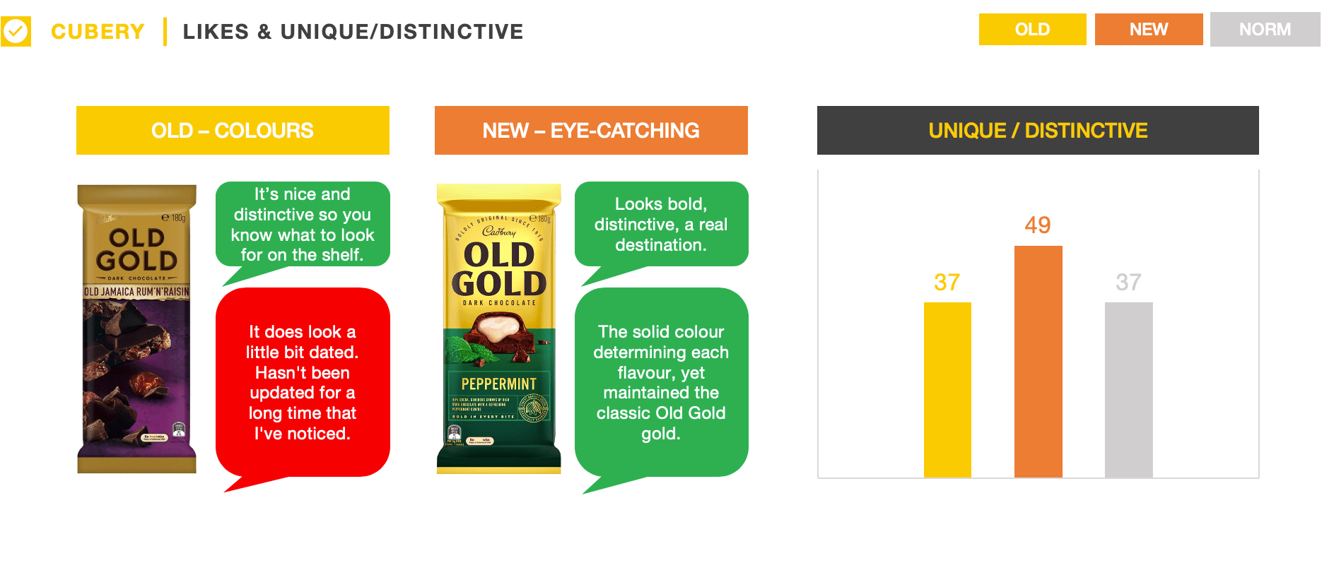
While alterations to the brand’s signature gold hue were notable, the brighter background enhanced the visual impact of the packaging and built stronger on-shelf presence.
Modernising aesthetic elements detached Old Gold from the ‘stale’ and ‘dated’ perceptions elicited by the previous packaging, while also better-informing people about the ingredients contained in each flavour – à la Cadbury’s broader range of chocolate blocks.
Importantly, the product information was clean and easily interpretable, while conveying impressions of ‘quality’ and ‘indulgence’.
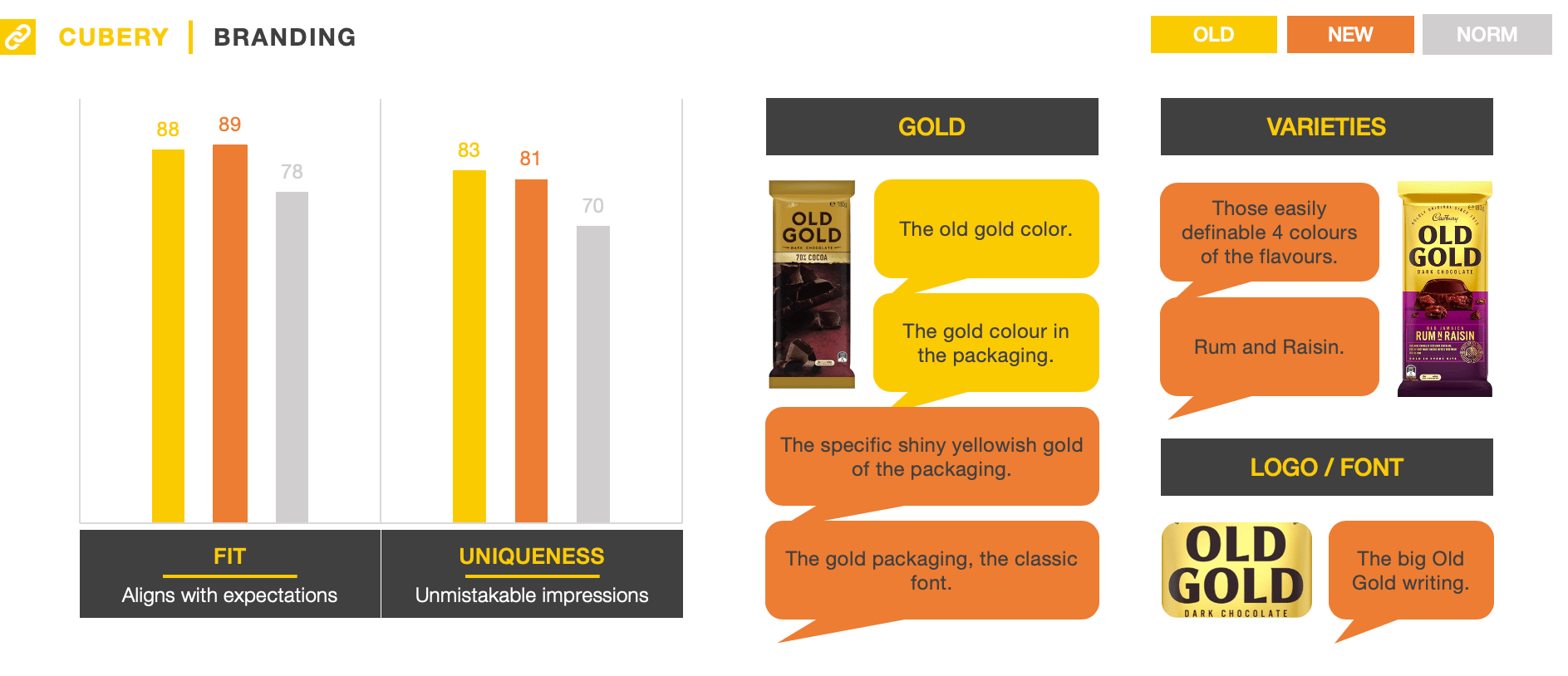
The revised packaging design stayed true to Old Gold’s heartland, keeping the brand’s distinctive assets intact while simultaneously modernising them.
The gold background – although significantly brighter now – is synonymous with Old Gold, with over half of people recognising the brand through this element alone. Similarly, the logo – which underwent subtle changes – was a seamless fit with Old Gold, helping reinforce the brand’s heritage.
A by-product of making each of the iconic flavour varieties more obvious was that people more strongly linked the product to Old Gold, indicating the colours and flavours are assets that the brand should continue to leverage.
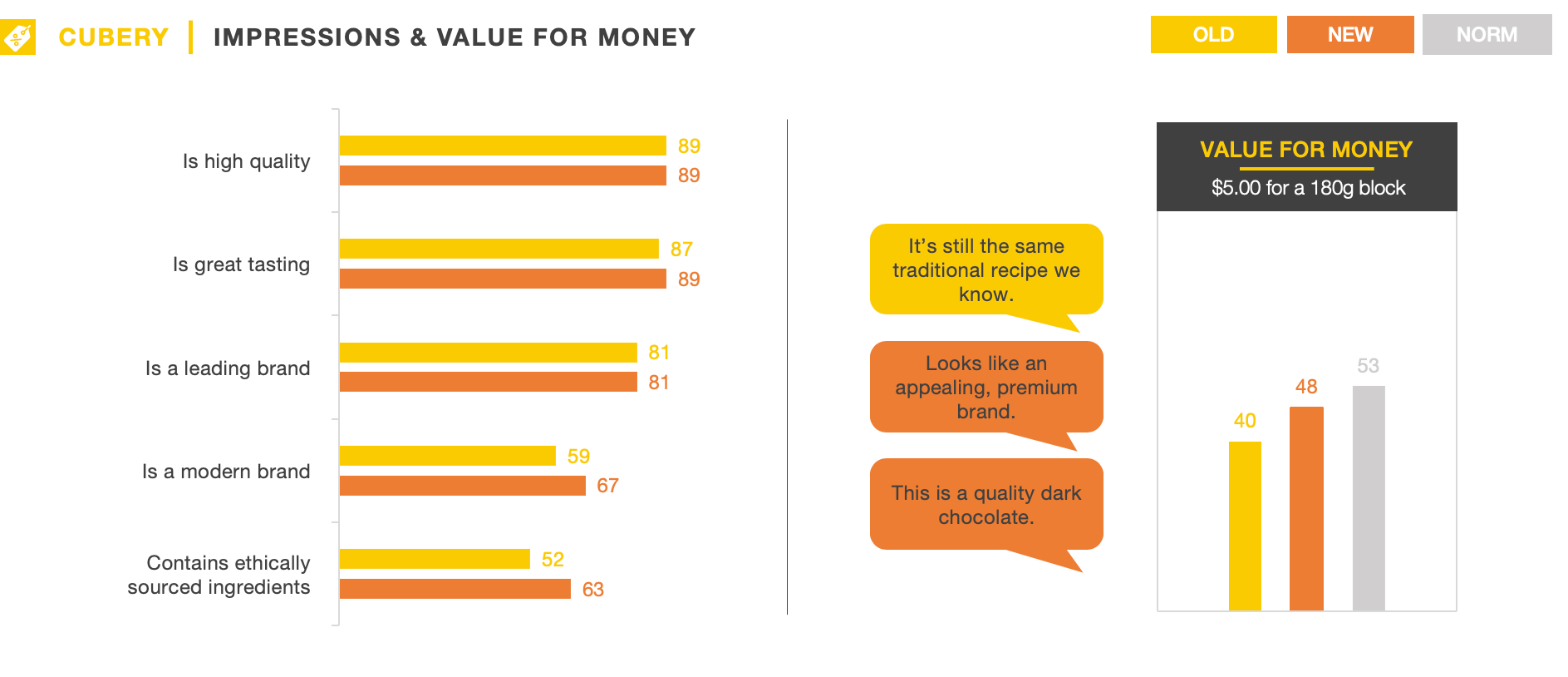
Despite undergoing significant changes, the key impressions people were left with across both designs were virtually identical, with the majority recalling ‘traditional’, ‘tasty’, and ‘dark’ sentiment.
Somewhat surprisingly, these ‘traditional’ impressions were more frequently recalled for the new design – even though it was also considered much more ‘modern’. This reflects how the new packaging not only closely aligned with the brand’s current positioning, but also tapped into broader category trends to present the product as ‘newer’ and more ‘relevant’.
Callouts to ‘ethical sourcing’ and more detailed flavour information better-informed consumers about the product and differentiated Old Gold from other dark chocolate brands. As a result, the new packaging made Old Gold a more compelling proposition overall, while also reducing price sensitivity.
Beyond its functional purpose, the main role of packaging is to make the product easily recognisable at the point of purchase, enabling shoppers to make quick and fluent decisions. Wholesale packaging changes which disregard the distinctive properties built up by a brand over time, risks damaging hard-earned equity.
Cadbury is a manufacturer which clearly understands the importance of protecting and nurturing brand assets, with the new packaging carefully balancing Old Gold’s long-standing heritage, while positioning the brand as modern and progressive. Overall, it is a text-book example of a highly effective packaging change.
Want to test your own advertising, packaging, or product ideas? Cubery combines a team of creative effectiveness experts with cutting-edge technology, bridging the gap between creativity and commercial impact. Get in touch to learn how we can unlock growth for your brand.

.png)