
Unfortunately, Internet Explorer is an outdated browser and we do not currently support it.
To have the best browsing experience, please use Google Chrome, Firefox, Microsoft Edge or Safari.
We use cookies to improve your experience on our website. By continuing to browse this website, you agree to our use of cookies. For more information, please refer to our privacy policy.


This is a self-funded case study using our packaging testing solution. Curious about the 9 essential ingredients for creating packaging that drives shopper growth? Explore our Packaging Effectiveness Playbook.
By now, most of us are well versed in what to do with our used plastic bottles. We buy, we consume, we dutifully place into the recycling bin — and we expect that our empty soda bottles will then be efficiently repurposed to repeat this cycle once more.
However, it’s not quite that simple. It may come as a surprise to some to learn that colored plastic can be detrimental to the recycling process, with its reduced quality (due to the dyes used) and added cost of sorting often consigning it to the dreaded single use pile.
Facing the mother of all irony, Sprite have conceded that their green bottles aren’t so green after all. By replacing all their iconic green bottles across North America with clear, eco-friendly substitutes, The Coca-Cola Company (Sprite’s owner) has boldly announced the brand’s strongest and most established asset will be deprioritized in the name of sustainability.
While a noble cause, will the change impact perceptions of the brand? Will the commitment to sustainability leave people feeling warm and fuzzy inside? Or will it go straight over their heads? Using our 3Cs methodology, we A/B tested the new eco-friendly packaging against Sprite’s classic green bottle to find out.

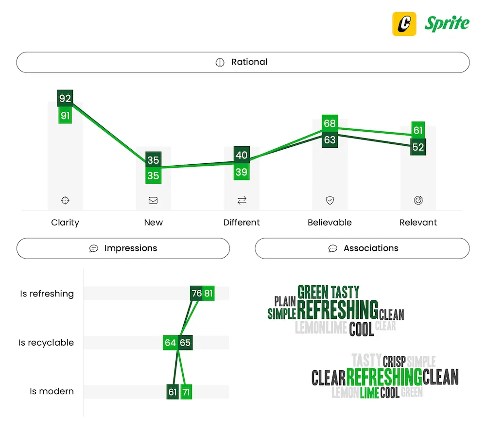
While the classic packaging was well-liked, awash with Sprite’s vibrant green, the new bottle wasn’t overly attention-grabbing. Although the simple, no fuss approach of both appealed to some, others were bored by their plainness. Interestingly, despite its simplicity, people enjoyed how the transparent packaging better highlighted the soda’s refreshing qualities — something disguised by the original tinted green bottle.

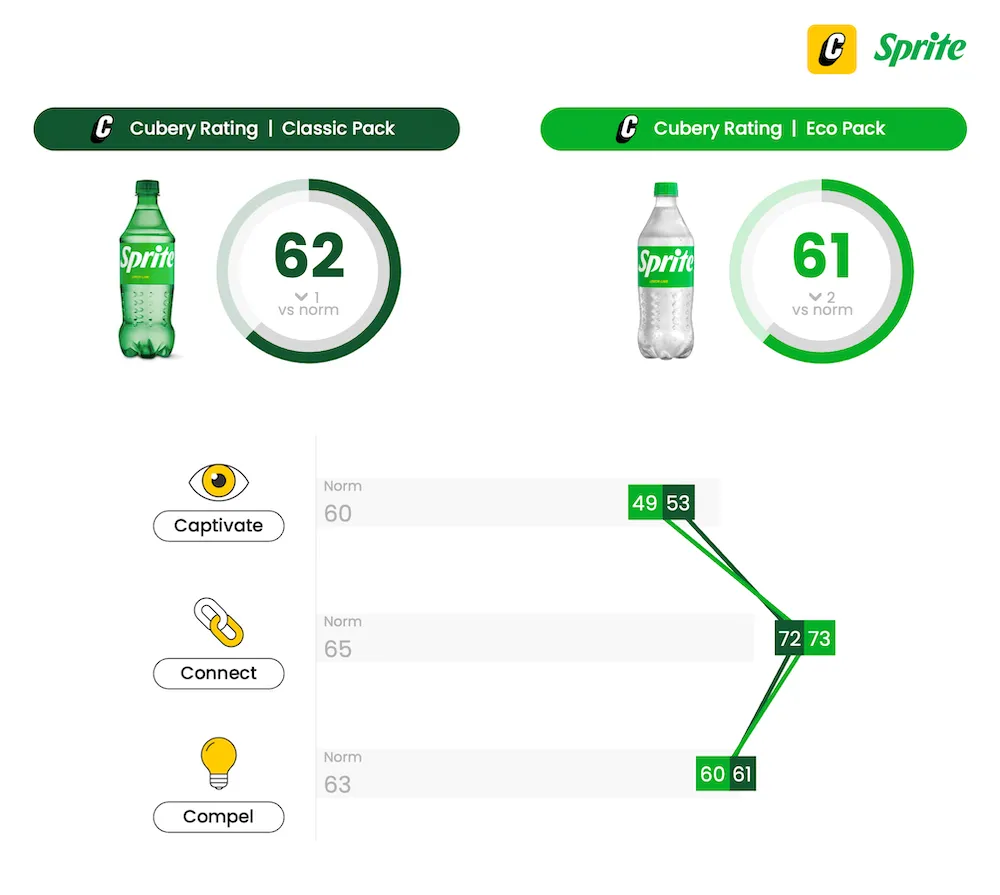
The color green is undoubtedly Sprite’s strongest asset, and its wholesale removal would’ve created a great deal of angst within the four walls of The Coca-Cola Company. However — in a case of addition by subtraction — the clear bottle instead spotlighted the rejuvenated label and enlarged logo with great effect. In drawing more attention to the label’s distinct color and prominent lettering, ‘Eco Pack’ proved equally effective at connecting back to Sprite.

While ‘Eco Pack’s clear presentation of the bubbly liquid boosted perceptions of the product being modern and refreshing, Sprite failed to capitalize on this favorability by adequately emphasizing the newfound eco-friendly focus. With no on-pack mention of the bottle’s eco-friendly credentials, few inferred that this was the reason for the shift. Subsequently, people didn’t take away any new or different information about the brand as a result of the updated packaging — limiting predisposition from being stronger than it perhaps could’ve otherwise been.
By not just paying lip service to sustainability, Sprite have inadvertently stumbled across an opportunity to modernize the brand, and enhance perceptions of refreshment and taste. That being said, not every brand will have the same good fortune as Sprite when disrupting entrenched assets. While a complete change of hero color — or secondary palette — might’ve resulted in a vastly different outcome, neutralization of the plastic’s color simply resulted in people’s gaze being redirected to the label itself — which was similarly effective in identifying the brand.
Where there was a potential missed opportunity was to further capitalize on people’s appetite for sustainability-related initiatives; the benefits of which are abundantly clear — most recently seen for Colgate’s eco-driven pack overhaul. Curiously, Coca-Cola has recently started rolling out labels which prominently draw attention to the bottle’s now ‘100% recyclable’ composition. We’d argue adding just a small call-out to Sprite’s label to elevate the impact of this commendable initiative (while also providing peace of mind for ‘loyalists’) would be a sensible and pragmatic thing to do.
Want to test your own advertising, packaging, or product ideas? Cubery combines a team of creative effectiveness experts with cutting-edge technology, bridging the gap between creativity and commercial impact. Get in touch to learn how we can unlock growth for your brand.

.png)