
Unfortunately, Internet Explorer is an outdated browser and we do not currently support it.
To have the best browsing experience, please use Google Chrome, Firefox, Microsoft Edge or Safari.
We use cookies to improve your experience on our website. By continuing to browse this website, you agree to our use of cookies. For more information, please refer to our privacy policy.


This is a self-funded This is a self-funded case study using our packaging testing solution. Curious about the 9 essential ingredients for creating packaging that drives shopper growth? Explore our Packaging Effectiveness Playbook. study using our Packaging Testing solution.
Famous for its ‘Nibble Nobby’s Nuts’ campaign, Nobby’s is Australia’s largest nut brand, having led the category since the 1950’s. Over the decades, Nobby’s has expanded its product range to cater for shifting tastes and preferences; however, its new Loaded Snack Mix marks a significant departure from the brand’s heritage.
The product itself breaks the status quo, with the ingredients going beyond nuts to include a variety of flavorsome additions, such as pretzels and pork crackle. However, it was the more overtly masculine and industrial-themed design that caught our eye, and we were interested to see how consumers would respond to the bold aesthetic.
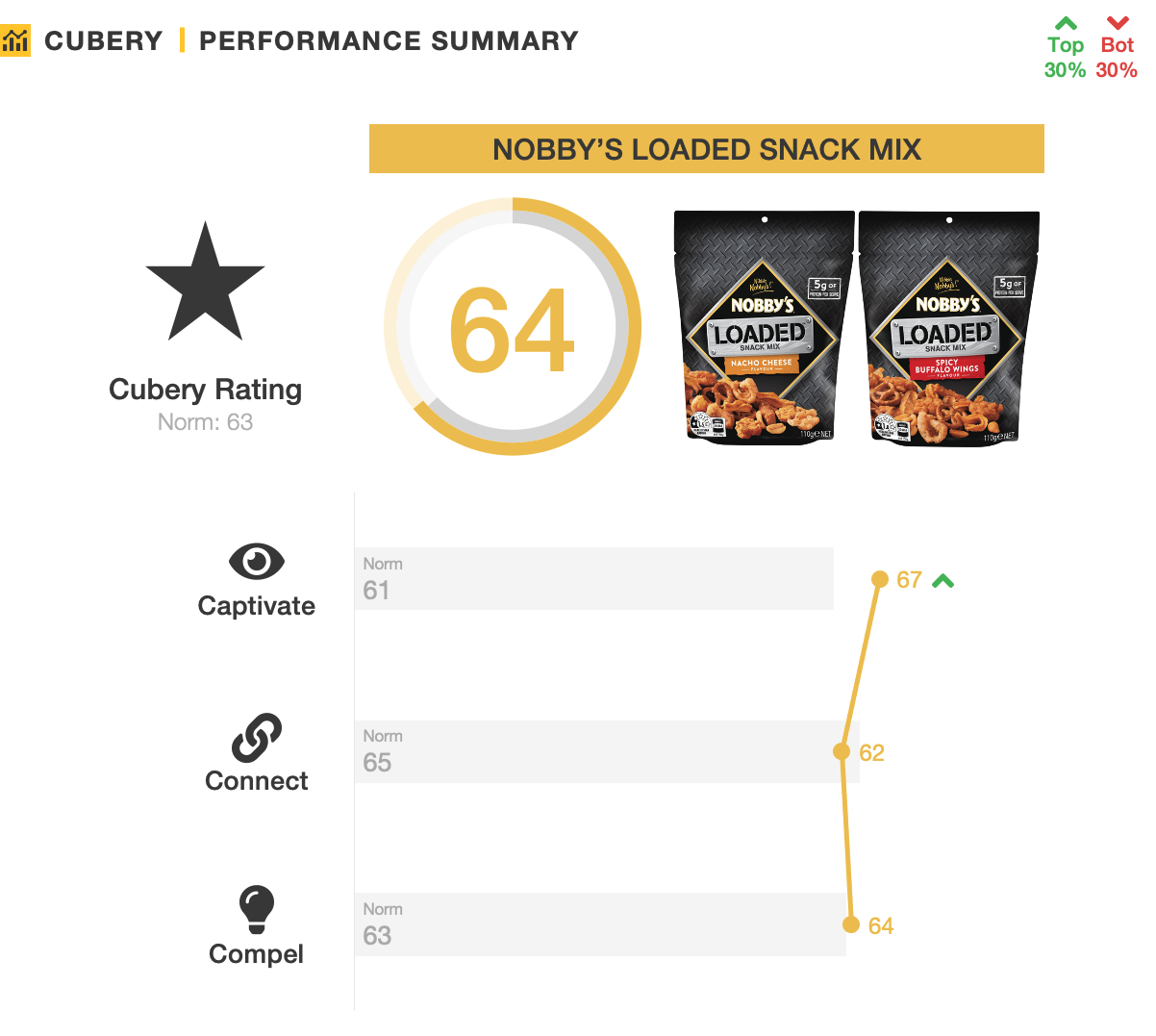
We used our three C’s framework to assess the effectiveness of the Nobby’s Loaded packaging:
The brief for the Nobby’s Loaded pack was to be different; a design that would stand out against both competitors and the brand’s existing range. In this regard the design was a success. People perceived the metallic industrial aesthetic and colors to be highly distinctive, creating a dramatic contrast versus the category’s typically warmer and more inviting stylings. For many this was viewed as an exciting new twist for the category and helped emphasize the appetizing contents of the package. However, despite its more traditionally ‘masculine’ cues, the packaging was no more appealing amongst men than women.
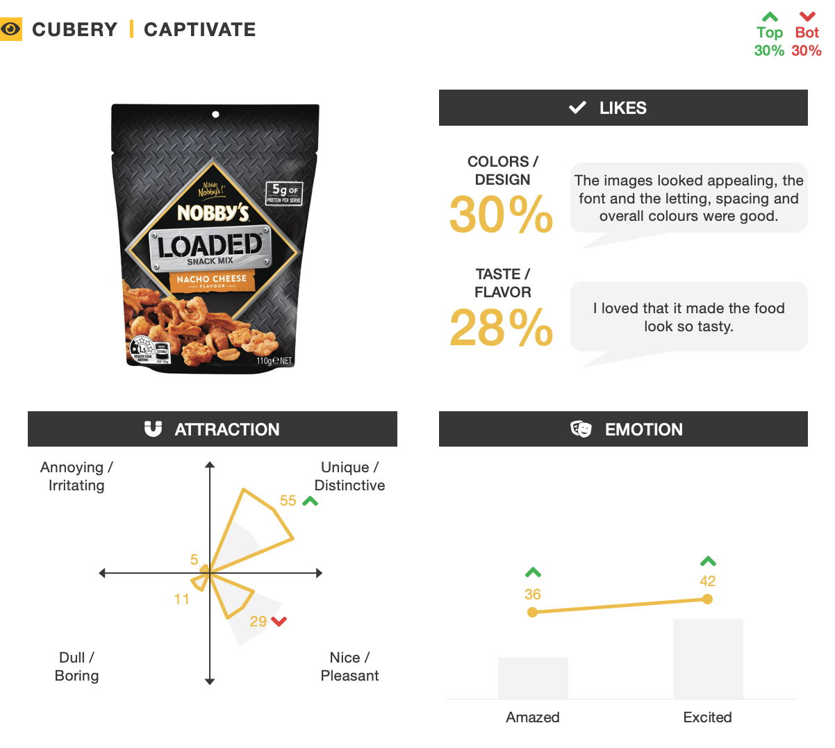
A notable minority did question the dark, metallic appearance, with some unsure about exactly what it was attempting to convey about the product. This disconnect led to the packaging being slightly out of sync with people’s expectations of Nobby’s. While many picked up on branding elements such as the Nobby’s logo and overall design language, the step away from traditionally vibrant colorings and less visually complicated aesthetics meant it was a weaker than expected fit with the brand.

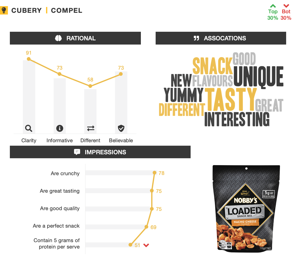
Emphasizing the product’s indulgent taste meant this was the strongest notion people were left with about Nobby’s Loaded. Although successfully getting across that it’s packed with flavor, the packaging did only an average job of conveying the product composition and distinctions of each flavor. One of the product’s more important callouts around containing 5g of protein per serve was only taken out by half of people – by far the lowest impression, and a key reason for why it wasn’t perceived to be overly different.
Marketers often prioritize standing out and grabbing attention above all else when it comes to the in-store experience, and for good reason – if the product doesn’t get noticed, it has little chance of being considered by shoppers.
But, it’s also important to ensure the design language is consistent with the brand’s broader range. Why? Firstly, in order to leverage masterbrand equity, design cues need to be easily recognizable. Secondly – and arguably more importantly – product extensions (and subsequently their packaging) don’t operate in a vacuum. Rather, they work together with the rest of the product range to provide a visual representation of the masterbrand – helping create clarity of positioning and build equity. For this reason, consistency and synergy across the product range is critical.
Not only were the darker and more masculine stylings somewhat out of sync with expectations of Nobby’s, but also the product’s more substantial and varied inclusions weren’t completely aligned with how Nobby’s is perceived by consumers. Together, these meant the packaging was only average at motivating consumer interest and trial.
Want to test your own advertising, packaging, or product ideas? Cubery combines a team of creative effectiveness experts with cutting-edge technology, bridging the gap between creativity and commercial impact. Get in touch to learn how we can unlock growth for your brand.

.png)