
Unfortunately, Internet Explorer is an outdated browser and we do not currently support it.
To have the best browsing experience, please use Google Chrome, Firefox, Microsoft Edge or Safari.
We use cookies to improve your experience on our website. By continuing to browse this website, you agree to our use of cookies. For more information, please refer to our privacy policy.


This is a self-funded case study using our packaging testing solution. Curious about the 9 essential ingredients for creating packaging that drives shopper growth? Explore our Packaging Effectiveness Playbook.
Most grocery shopping is done in a largely unconscious way, underlining the critical role packaging plays at the point of purchase. Given the need for packaging to work near instantaneously, brands must tread carefully when undertaking a design overhaul.
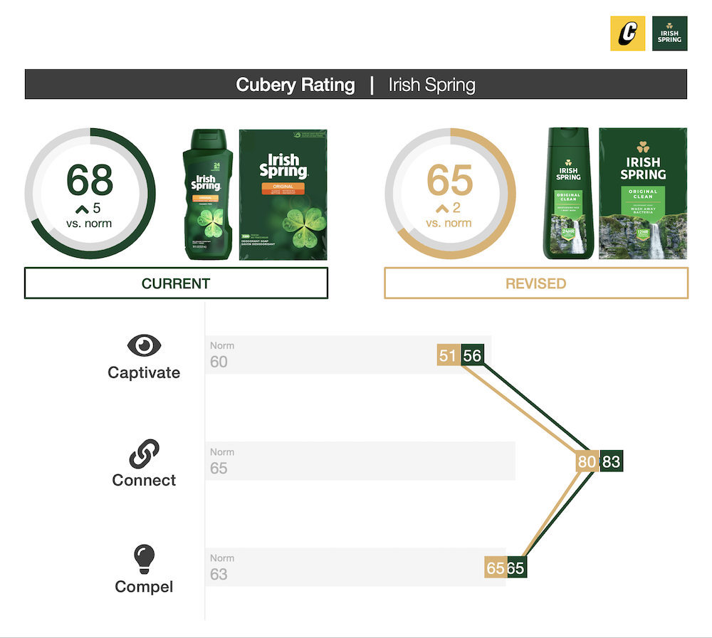
Having been around for over 50 years, Irish Spring decided a fresh and modern look was needed to build greater relevance amongst a younger audience; or, as designer Steve Dunphy put it, to “communicate the pure essence of Irish Spring [by] moving beyond its past”. With the aim to “develop a discreet and stylish presence”, we were keen to see if Irish Spring’s redesign was able to retain the brand’s strong distinctive assets while appealing to a new audience. We tested it using our 3Cs framework to find out.

The new design had a greater emphasis on nature — showcasing scenic imagery of waterfalls, lakes, and rivers across the product range, with the goal of “inviting [people] into an experience”. The picturesque scenery evoked feelings of warmth and contentment, while simultaneously neutralizing dull sentiment which overshadowed the previous design. However, the stock-looking imagery featured was considered a familiar trope for the category, and as such the new aesthetic wasn’t able to spark the same level of curiosity as its predecessor. Being considered less distinctive overall subsequently diminished the new pack’s ability to stand out on-shelf.
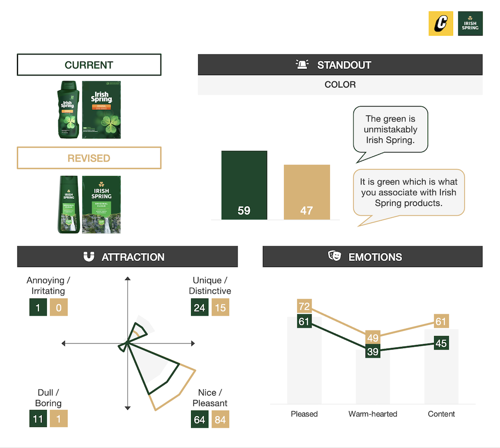
The previous packaging was highly recognizable — the green coloring, large shamrock, and prominent sentence-case logo all provided familiar cues to the Irish Spring brand. While the redesign altered a number of these assets — including a new capitalized lock-up (with golden shamrock) and emphasized benefits around the soap’s scent and hygiene — the new pack still maintained very close linkage to the brand (the green color acted as a powerful cue). The Irish Spring team also made the astute decision to transition to the new design in two stages — first releasing an interim pack which maintained much of the original design, with the key addition of the new darker, richer green.
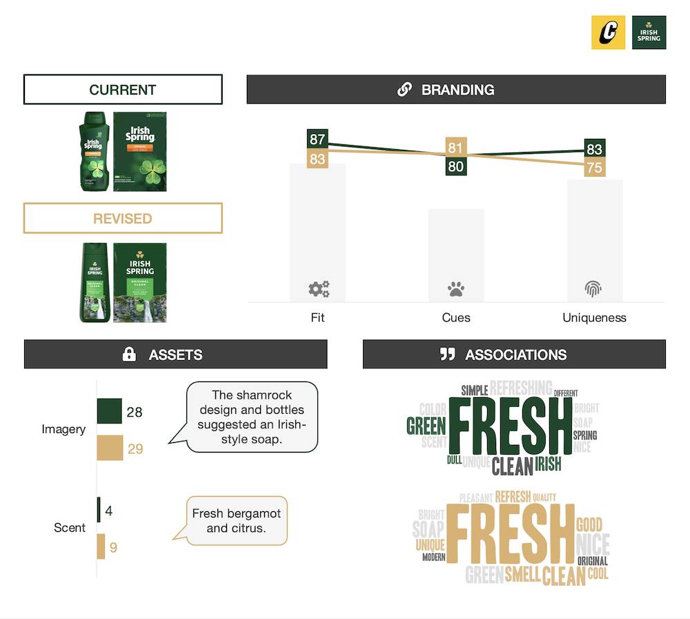
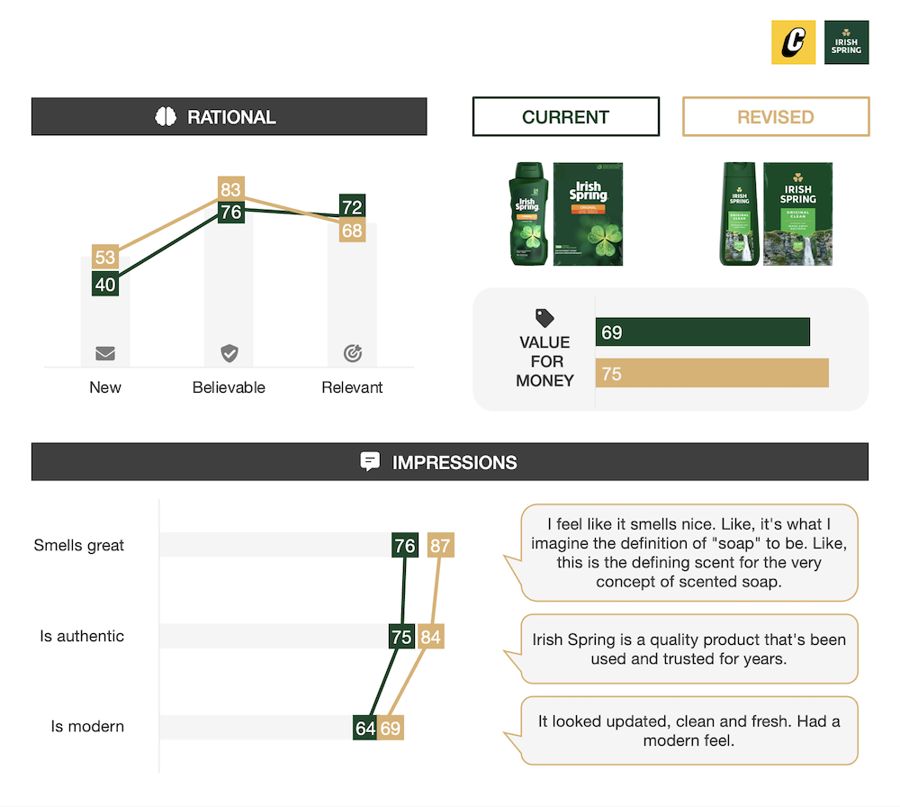
The packaging delivered on the key objective of making the brand seem more modern and stylish, particularly amongst younger consumers. The updated imagery also better-synergized with key benefits featured on-pack, reinforcing the product’s freshness and elevating the soap’s perceived aroma. However, while the modernization had a favorable impact on perceived value, the more generic imagery detracted from the emotions people were left feeling toward Irish Spring.
Much has been written recently about the movement toward “flatter” and simpler logos and design, which has been no more evident than in the luxury goods category. And while well-intentioned — providing brands with greater flexibility in a mobile-first world — the risk it runs is brands converging into the dreaded “Sea of Sameness”.
While there’s lots to like about the premiumization of Irish Spring and careful planning that went into managing the transition, what all brands must be cognizant of is developing properties which are truly ownable. Here, the utilization of category-generic waterfall imagery meant the packaging wasn’t as effective at catching shoppers’ attention on-shelf, nor building favourable associations and feelings.
So, while the green hue and contrasting white logo helped do most of the heavy lifting to maintain familiarity, on balance the revised imagery ultimately held the packaging back.
In an environment where decision-making occurs in a fast and frugal way, being easily recognizable is only one part of the shopper marketing jigsaw puzzle; standing out and seeding the right ideas in people’s minds both play an equally-important role in getting products into shopping carts.
Want to test your own advertising, packaging, or product ideas? Cubery combines a team of creative effectiveness experts with cutting-edge technology, bridging the gap between creativity and commercial impact. Get in touch to learn how we can unlock growth for your brand.

.png)