
Unfortunately, Internet Explorer is an outdated browser and we do not currently support it.
To have the best browsing experience, please use Google Chrome, Firefox, Microsoft Edge or Safari.
We use cookies to improve your experience on our website. By continuing to browse this website, you agree to our use of cookies. For more information, please refer to our privacy policy.


This is a self-funded case study using our packaging testing solution. Curious about the 9 essential ingredients for creating packaging that drives shopper growth? Explore our Packaging Effectiveness Playbook.
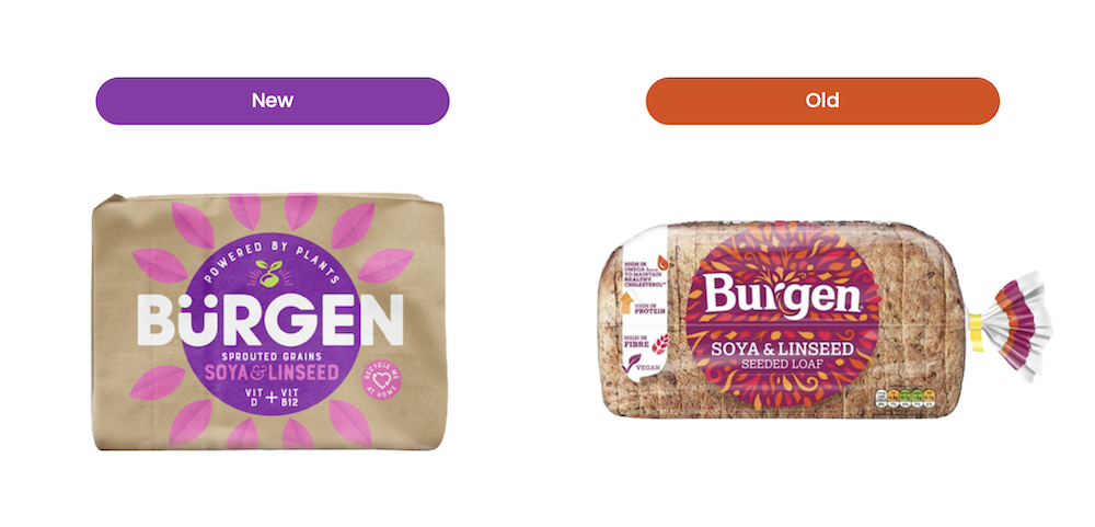
Sustainability and minimalization have been two hot topics in the packaging world over recent years, but what about when a brand attempts to deliver on both within a single redesign? Enter Bürgen bread.
In moving away from conventional clear plastic wrap, Bürgen introduced a paper bag exterior alongside a bolder and more modern visual aesthetic. With the brand’s strong health credentials (centered around ‘Plant Power Positivity’) key to its existing positioning, did the new approach stay true to these ideals? Was the redesign able to keep intact the brand’s ‘better for you’ promise? We put both to the test using our 3Cs framework:
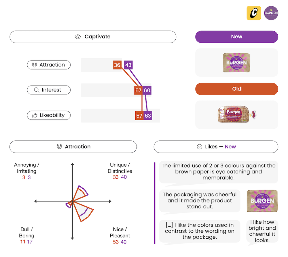
The revitalized packaging proved more distinctive and eye-catching, with the pink and purple color scheme building greater contrast against the rustic brown backdrop. While the break away from transparent plastic (a category staple for decades) to a windowless paper bag irked some — no longer being able to see the contents inside — on the whole people still favored the environmentally friendly shift.
Design agency, DesignHappy, were tasked with helping Bürgen cut through the saturated bread category. With the goal of shaking things up — but at the same time being “respectful” of the brand’s heritage — the outcome was a design that not only dialed-up the existing pack’s boldness, but also maintained a level of familiarity. Building off the established structural layout, together with a more pronounced logo and enhanced leaf imagery, this created a strong link back to Bürgen. Importantly, departing from category conventions ultimately created a more uniquely ownable aesthetic for Bürgen.
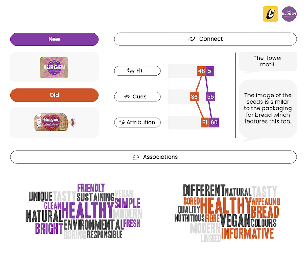
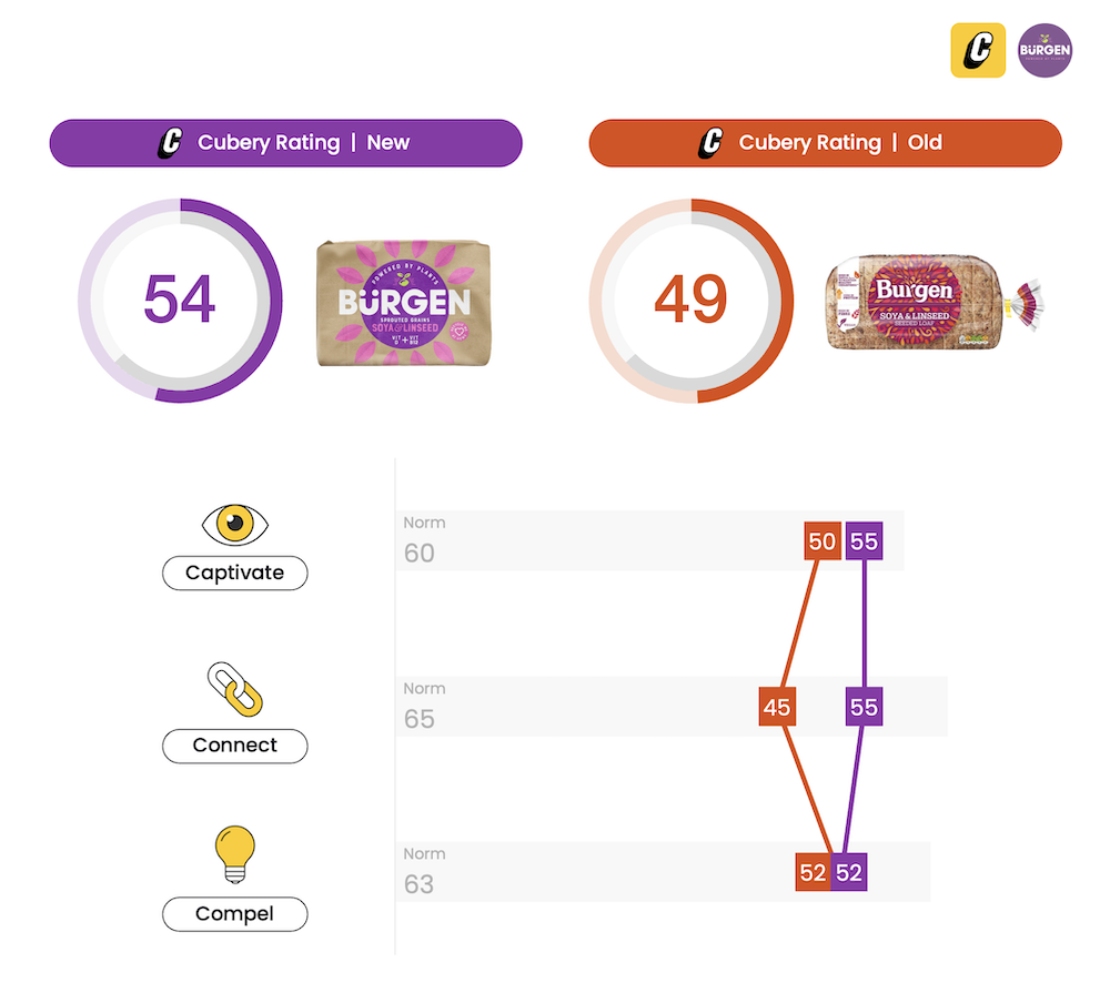
Despite its success in the ‘distinctive’ department, Bürgen ultimately came up short in its ability to get across intended taste and nutrition perceptions. It was seeing the bread itself that was the key driver of wholesome credentials, and without the transparent window Bürgen’s task in getting across these health associations became all-the-more difficult. The added ‘Plant Power Positivity’ call-out was intended to support these ideas, but it ultimately wasn’t any substitute for seeing the product itself. The new wrapper did, however, succeed in boosting Bürgen’s environmentally friendly credentials — strengthening positivity toward Bürgen, and ultimately ensuring the redesign was as equally compelling as its predecessor.

Shifting away from category conventions when it comes to a pack refresh can present a conundrum for marketers. The appeal of doing something different — while often necessary — can come to the detriment of elements that have bedded in over-time and become second nature for shoppers. A design overhaul might result in your product no longer being easy to find and buy, but even worse it can prompt shoppers to second guess their purchase and investigate alternatives — which might prove to better meet their needs.
Bürgen not only succeeded in modernizing the brand’s look and feel, but more importantly it created a set of distinctive assets that the brand can actually own — which is particularly beneficial in a category largely full of conformists. As the old saying goes, when everyone else is zigging, zag. Perhaps the only thing Bürgen might want to consider — based purely on the aesthetic and nothing else — would be to find a more balanced compromise between health/taste and the brand’s newfound eco-friendly focus. Would the amalgamation of the brown paper bag exterior and a small transparent window (to showcase its unique composition and premium ingredients) have struck a better balance?
Want to test your own advertising, packaging, or product ideas? Cubery combines a team of creative effectiveness experts with cutting-edge technology, bridging the gap between creativity and commercial impact. Get in touch to learn how we can unlock growth for your brand.

.png)